 October, 2024
Client Project
Design of a new symbol and logotype for RiMusic, an open-source music player app for Android, based on Youtube Music, with a community of thousands of users
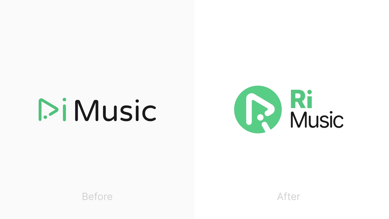
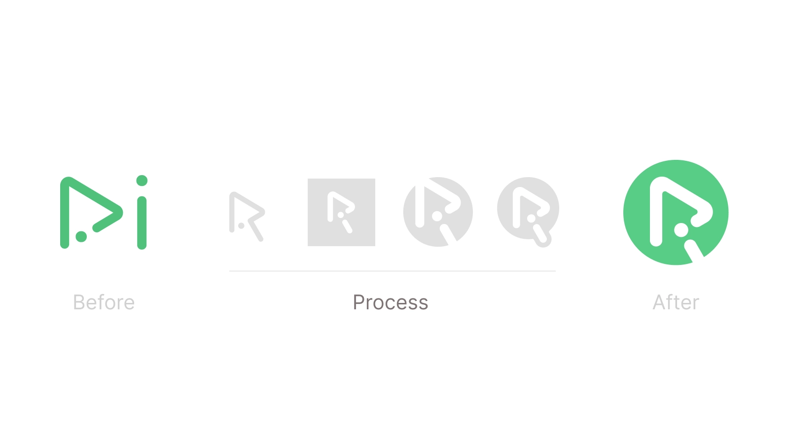
Before and After
RiMusic had an evocative and descriptive symbol, but it was not as legible in the context of the logotype
Its visual quality as a thin line-based symbol made it not as impactful when presented alone
It needed a change, but not a radical one
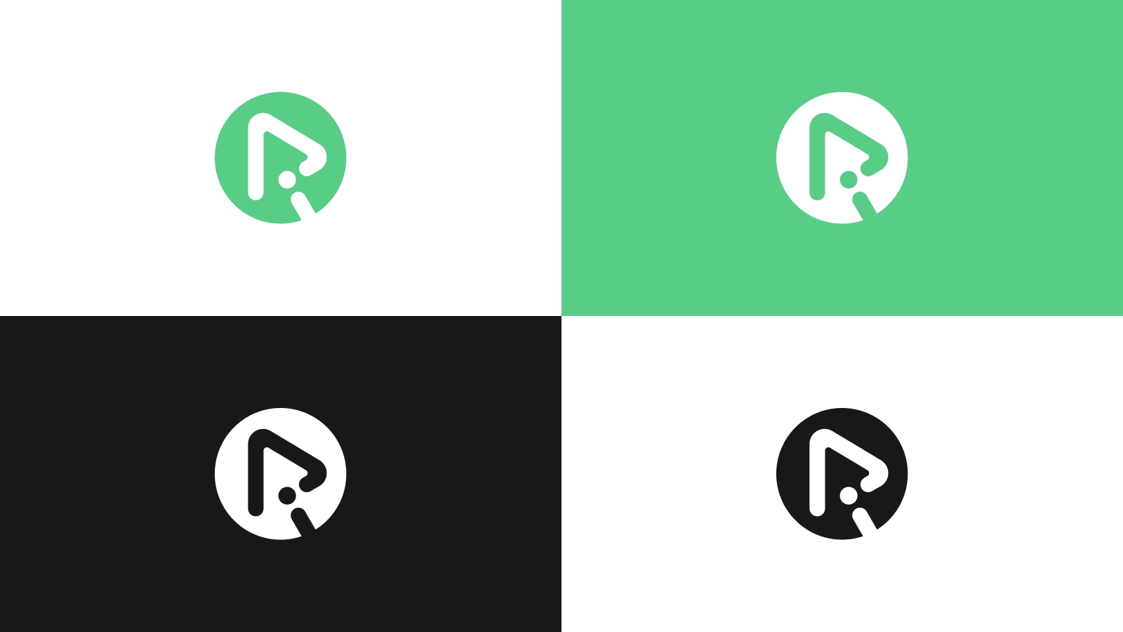
Process
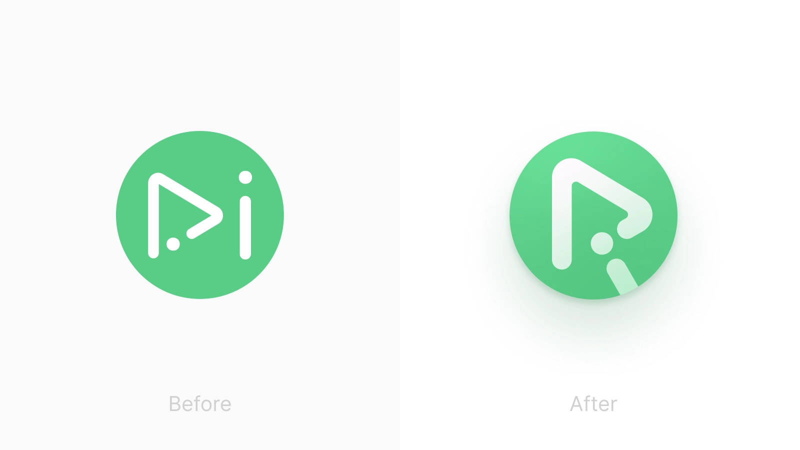
The previous icon was recognizable and had a key visual intent: the ‘play’ button as an ‘R’. But it was difficult to read it as such
With the new design I wanted to emphazise that ‘R’ thanks to the shape of the ‘i’, integrating it all inside the button with a bolder stroke
A very simple formula based on the existing design, almost obvious in retrospect
Inside the app
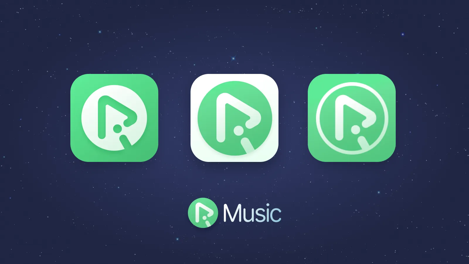
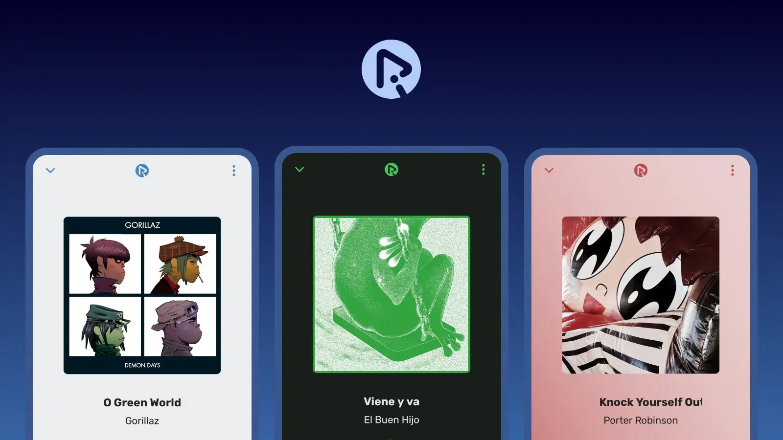
When it comes to adapting to the app’s icon and interface, it does so seamlessly
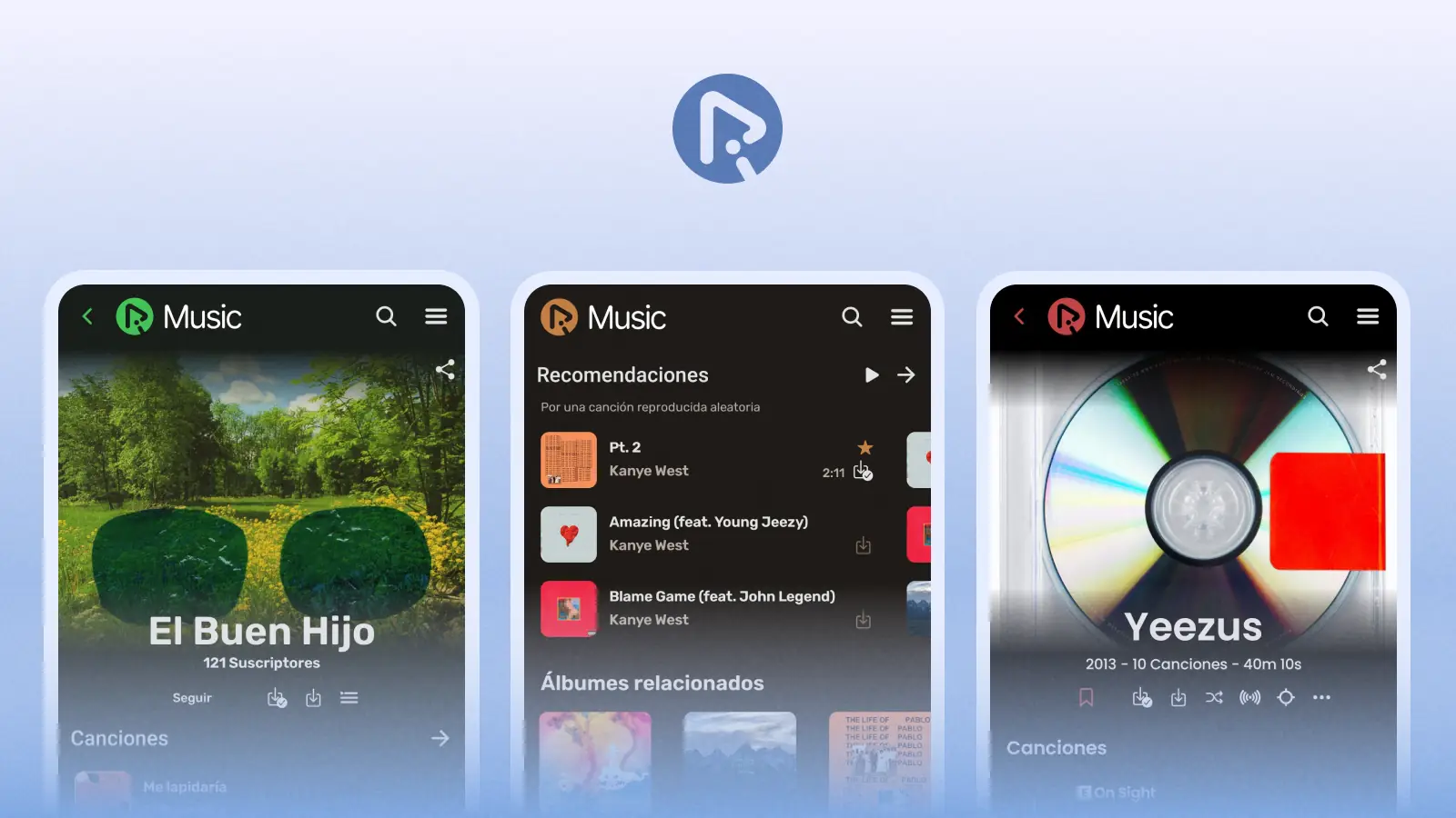
It’s specially flexible thanks to the dynamic theme, which presents it in different colors that match the album art of the currently playing music
Also, a new version of the logotype is designed, to be used in the app’s header: it is an abreviated logo that includes the new symbol and the word ‘Music’
Website
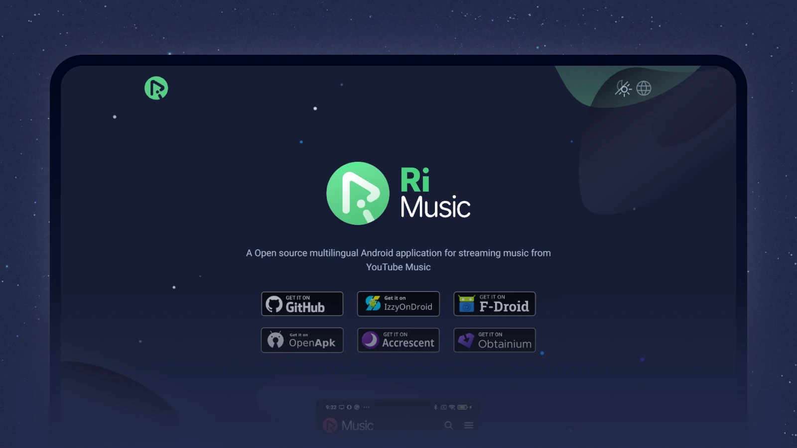
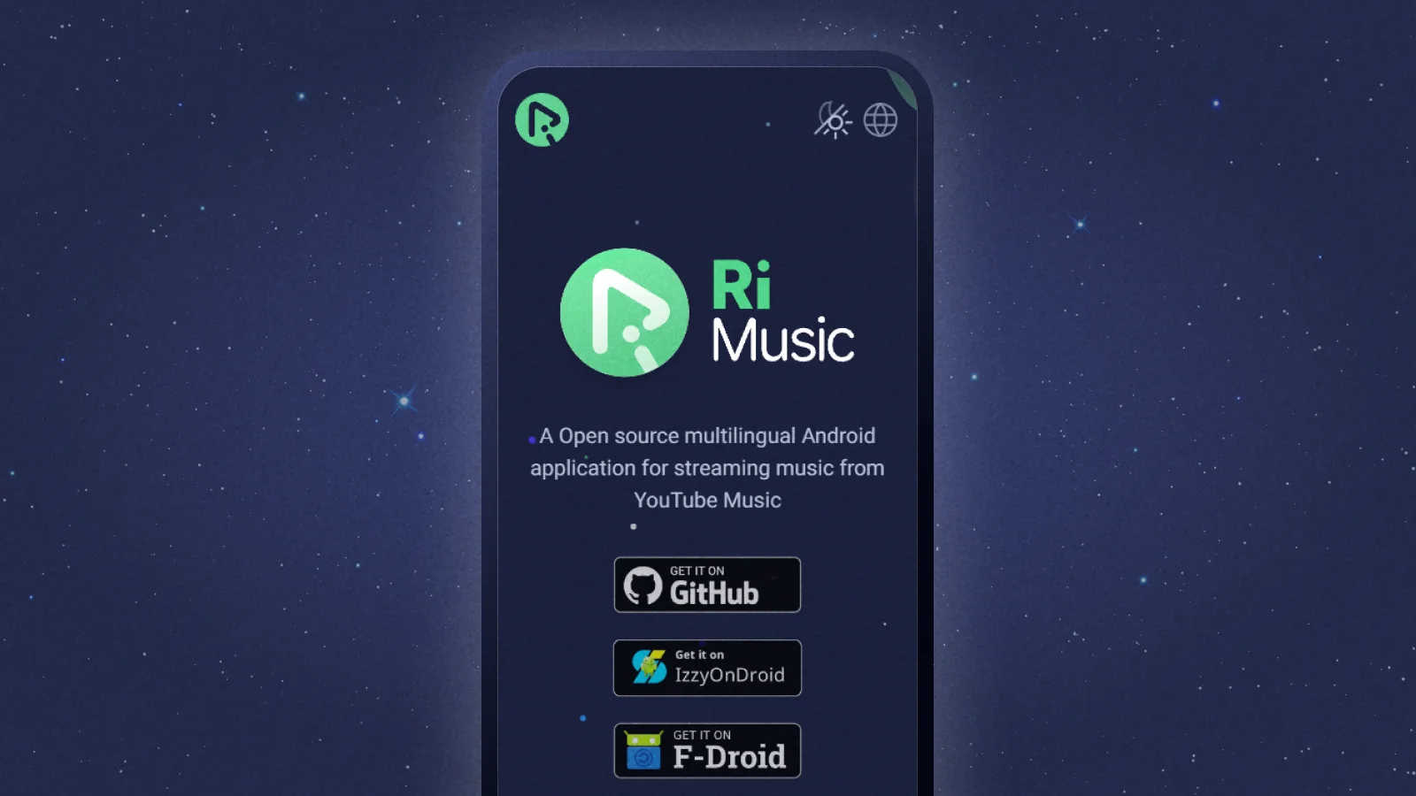
The new logo and symbol are prominently displayed in the app’s official site
