 March, 2025
Client Project
Branding, visual refresh and web development of an updated website for Molly, a messaging app based on Signal for Android
With improved security and privacy, among other added features, it has gathered a community of thousands of users in the infosec and digital privacy niche
A key goal of this ongoning collaboration is to make Molly the best Signal app for a wider userbase
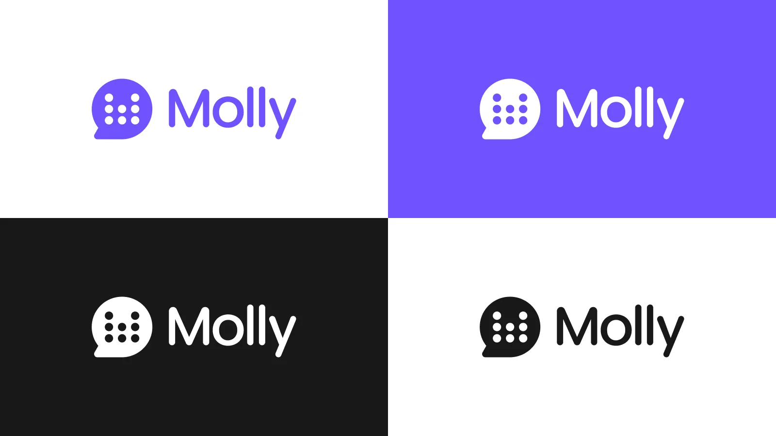
Brand Update
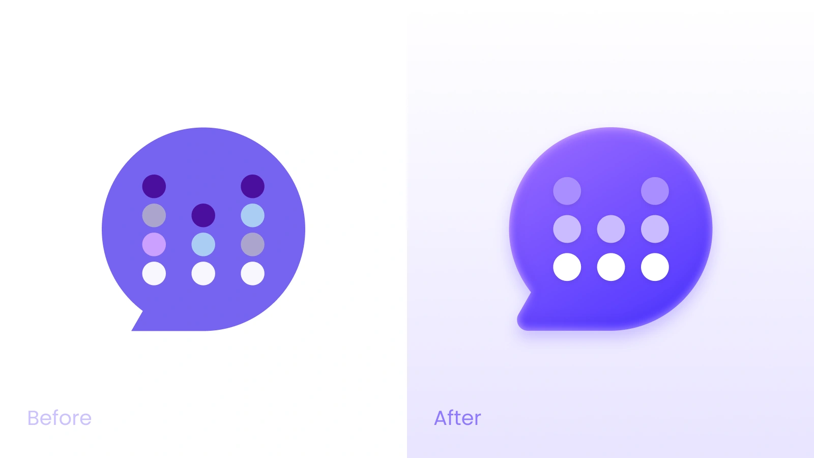
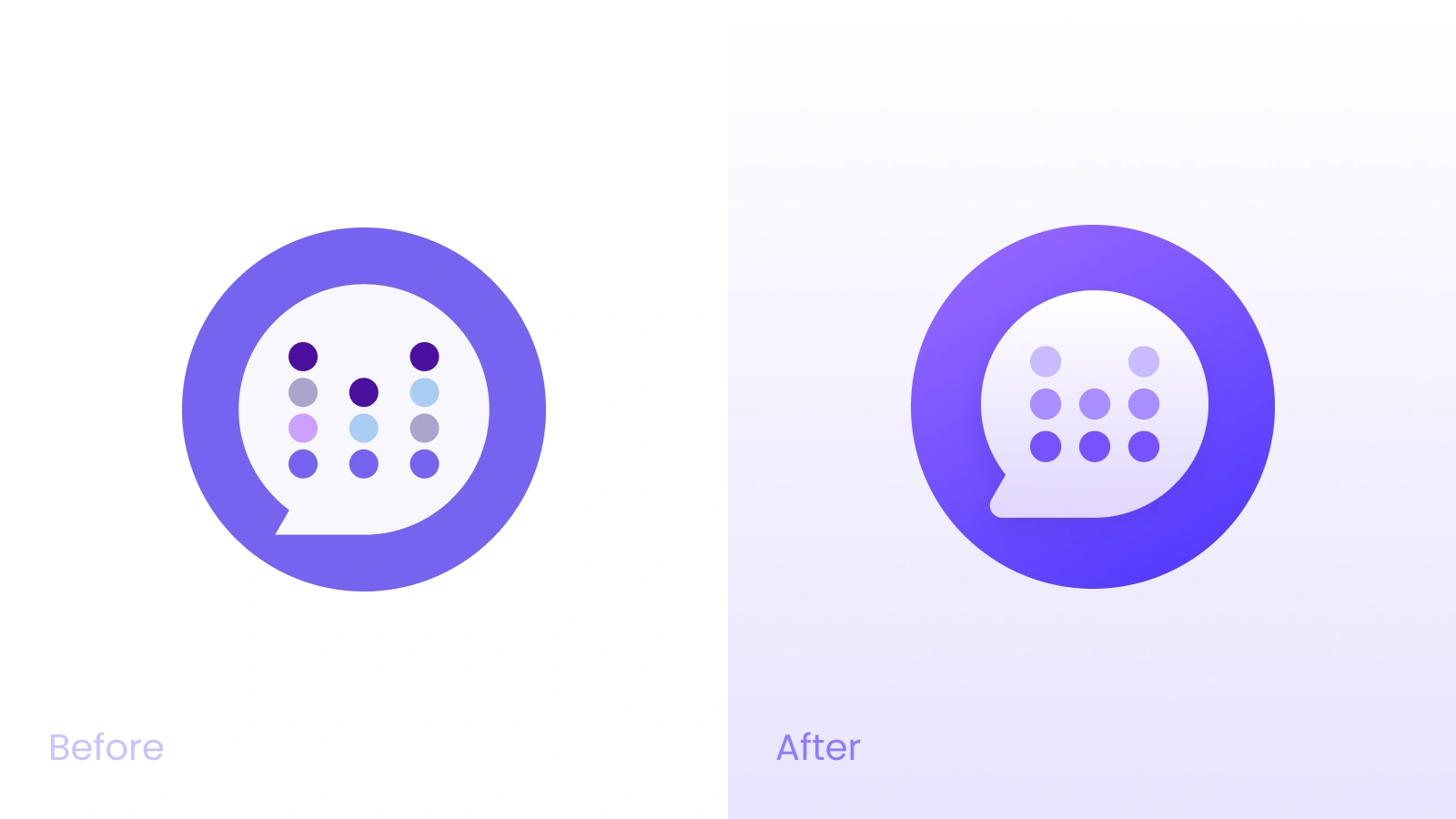
The process starts with a refresh on the visual brand, keeping it recognizable and coherent, yet with a more present-day and vibrant look

UI improvements
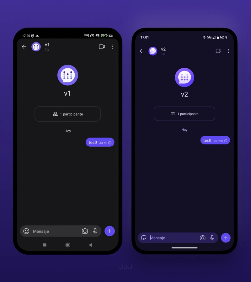
With the refresh, the app’s color palette has been revised and refined
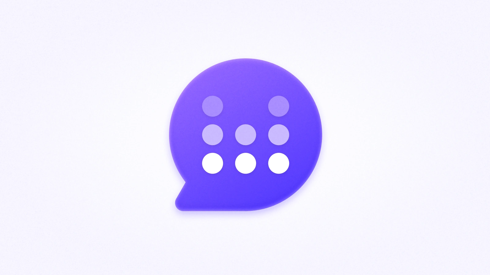
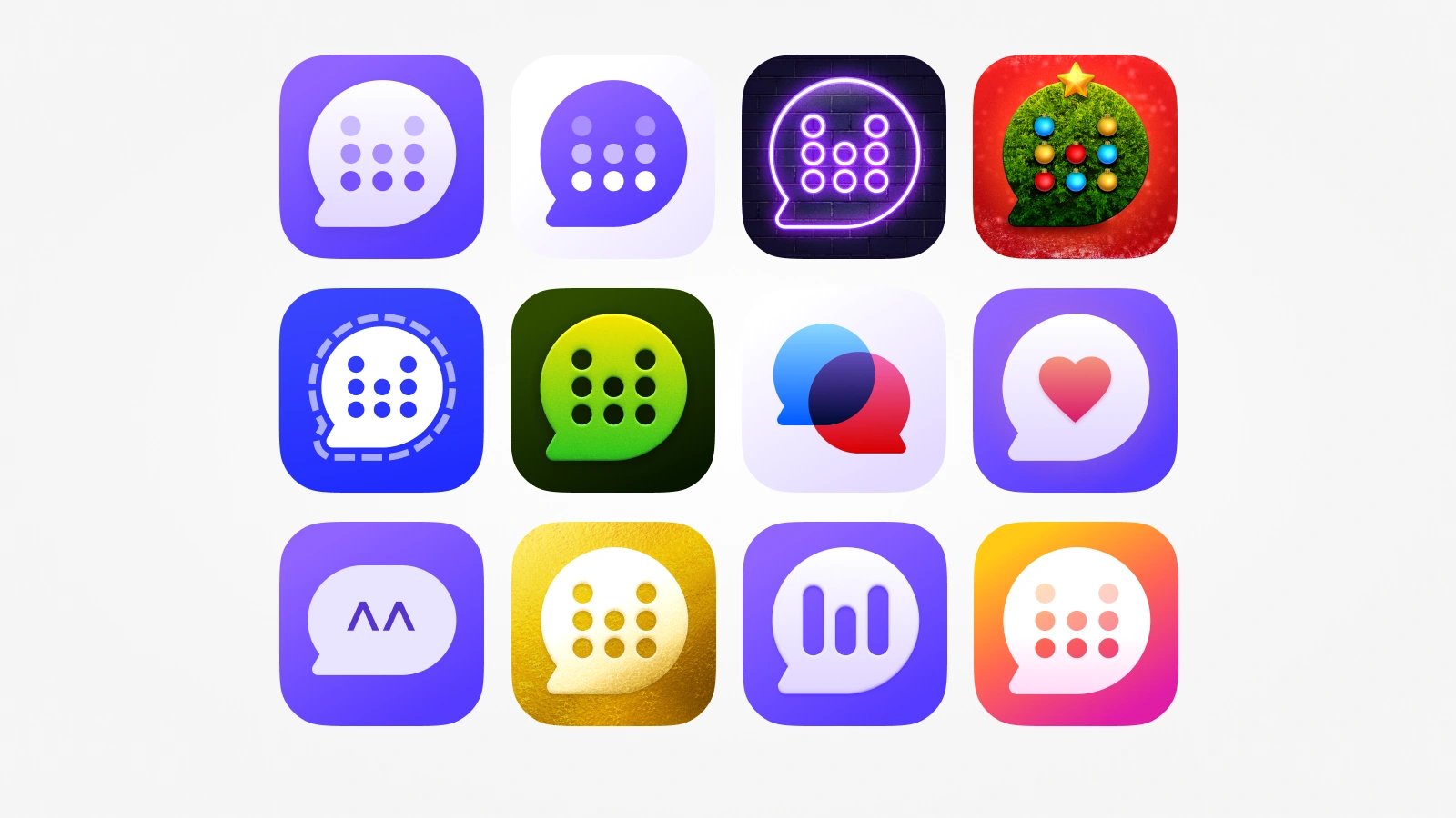
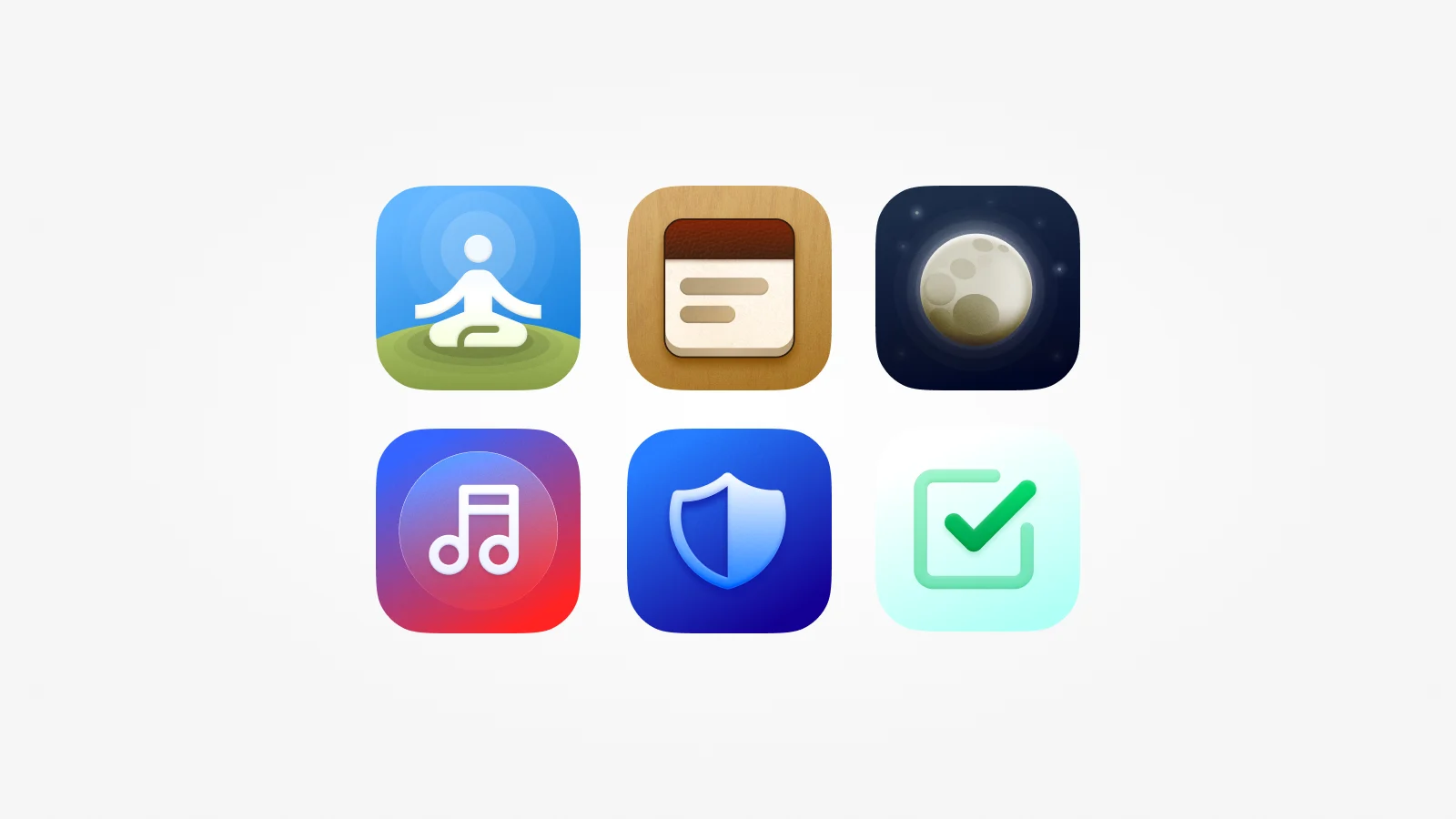
It was also a great opportunity to design alternative icons to replace those that Signal offers by default (which have their branding)
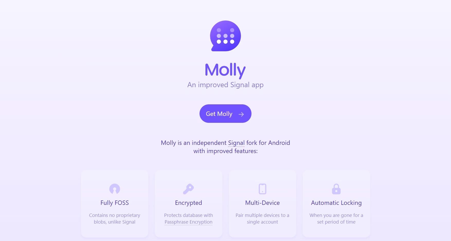
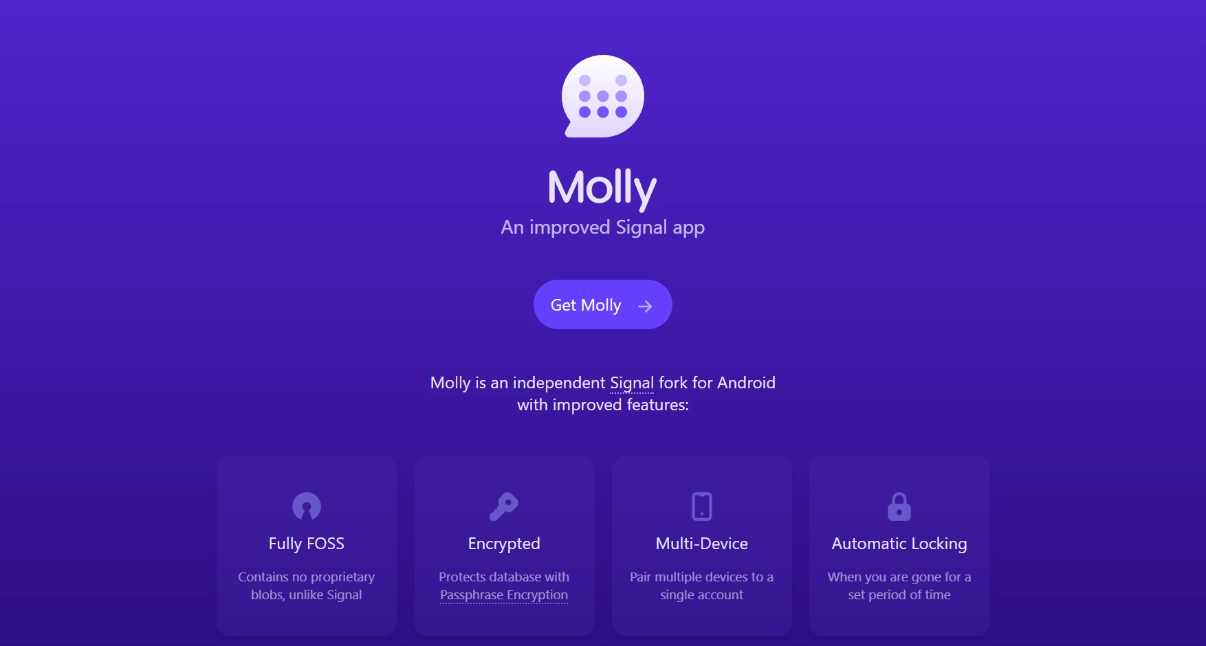
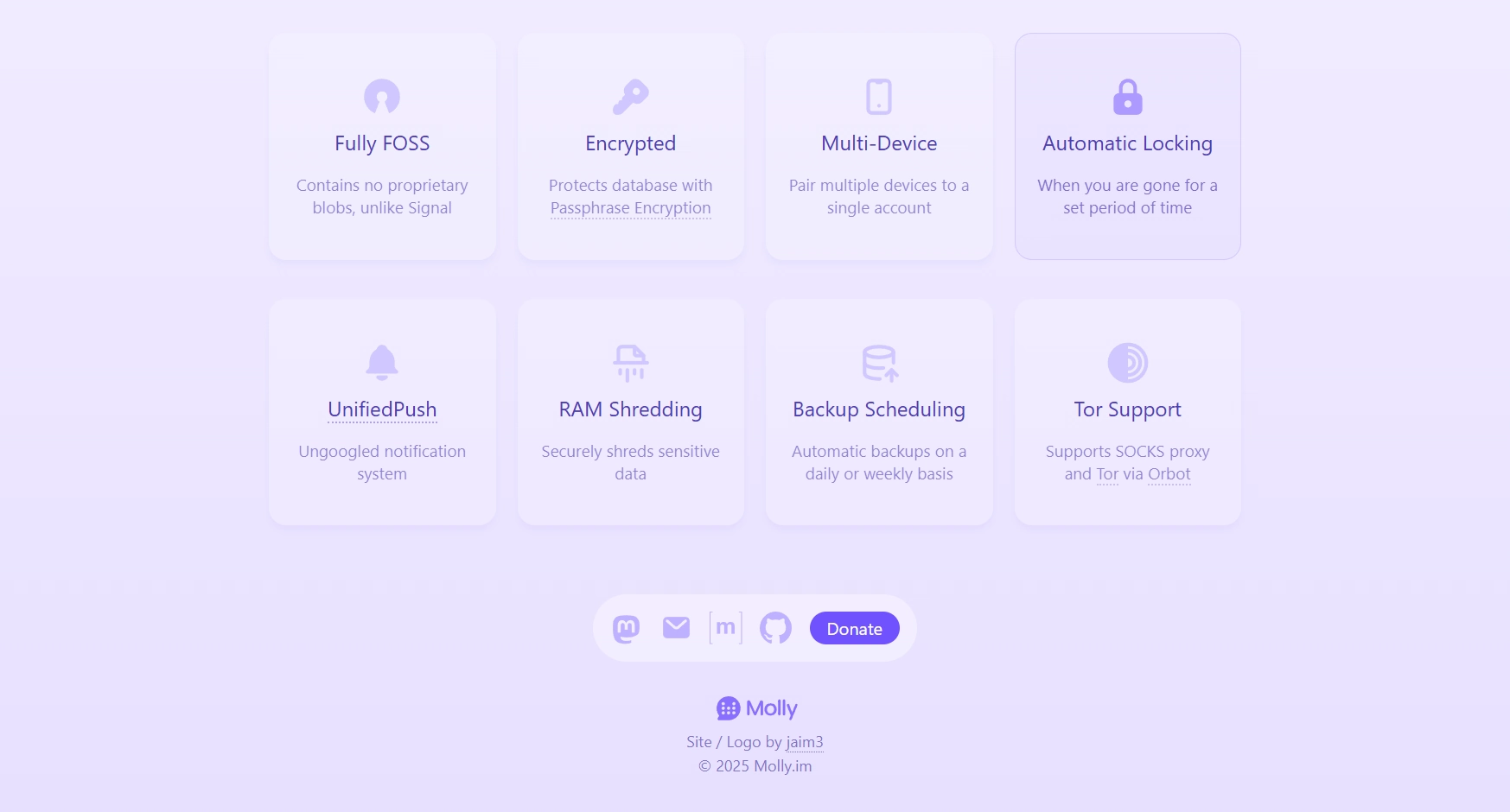
Website: Before and After
Molly had an informative and minimalist website, but its design was starting to look more older than present, plus it wasn’t fully intuitive at a first glance. The new design repackages and expands that information in a more responsive and current manner
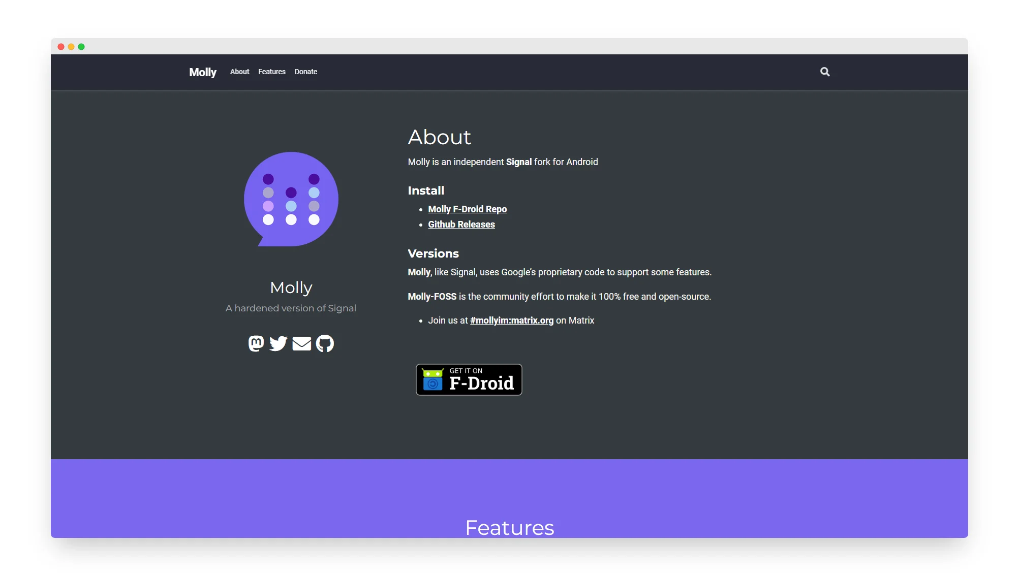
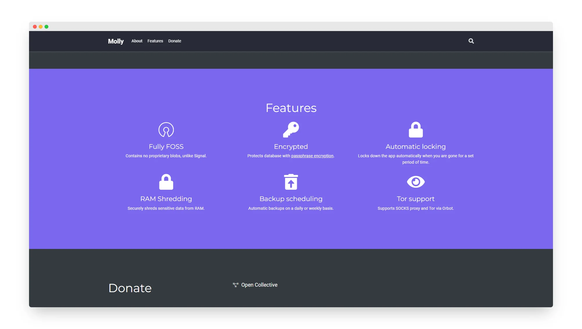
The new design takes the same information and condenses it in a more hierarchical way, better guiding the attention of the user
It also updates the aesthetics, showing Molly as the modern and actively developed app that it is
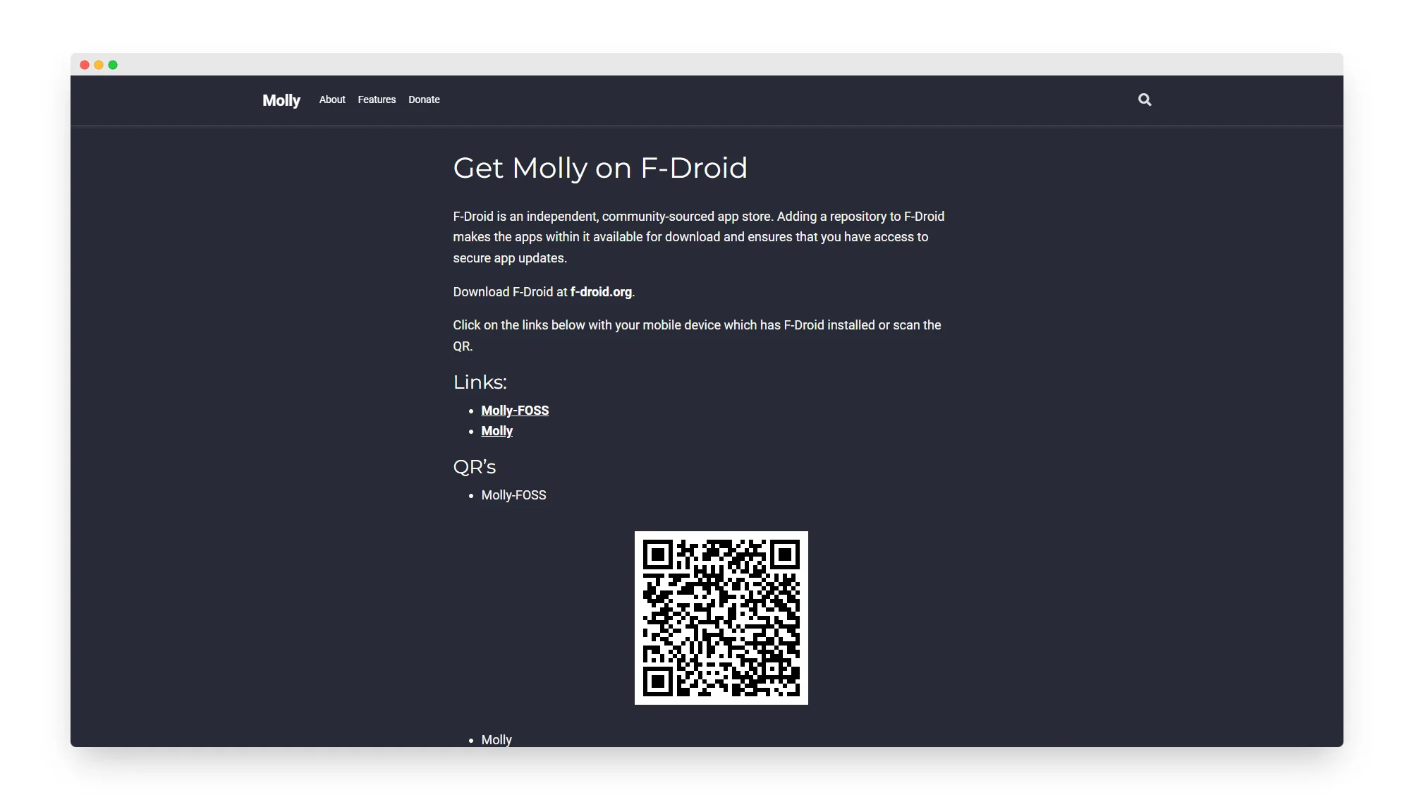
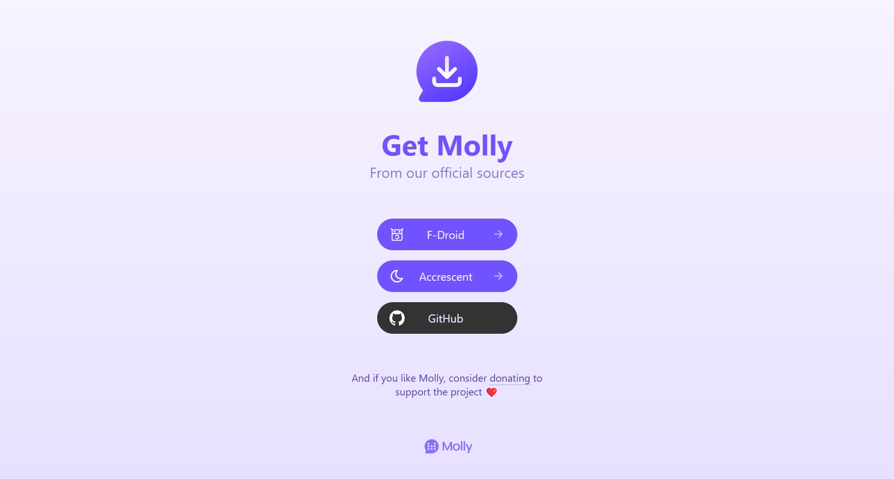
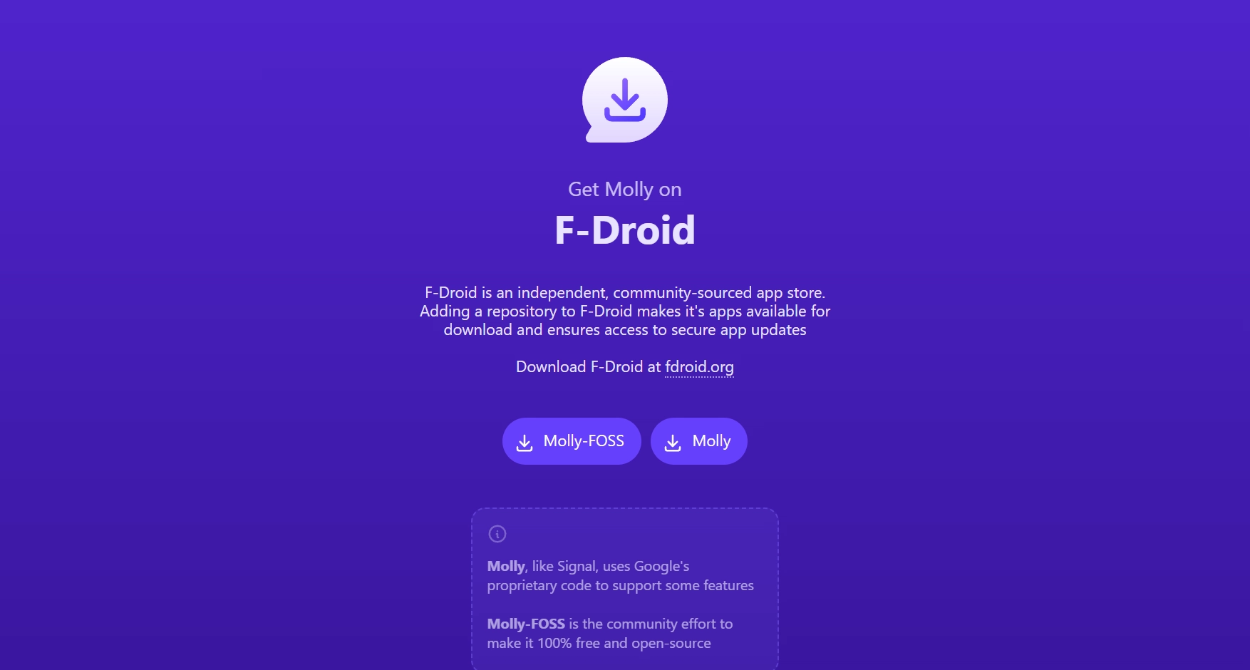
The previous download page was less intuitive than the home page, with an unclear visual hierarchy
The new one takes all the existing elements and reorders them in a clear and clean way
Promotional images
