 October, 2024
Client Project
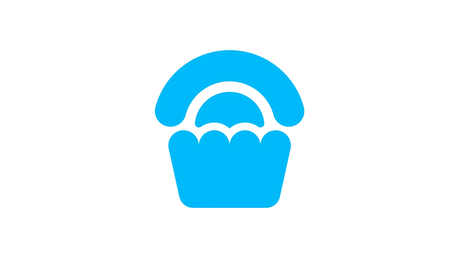
Logo symbol and app icon for Cupcake, an offline non-custodial crypto wallet by Cake Labs, makers of the popular app Cake Wallet
Design Brief
The brief that Cake gave me was simple: design the app icon for an upcoming companion app that was close to ready for release in Android and iOS
It was going to be an air-gapped (offline) crypto wallet, with similar security to a hardware wallet. The name was already decided: Cupcake
Design Process
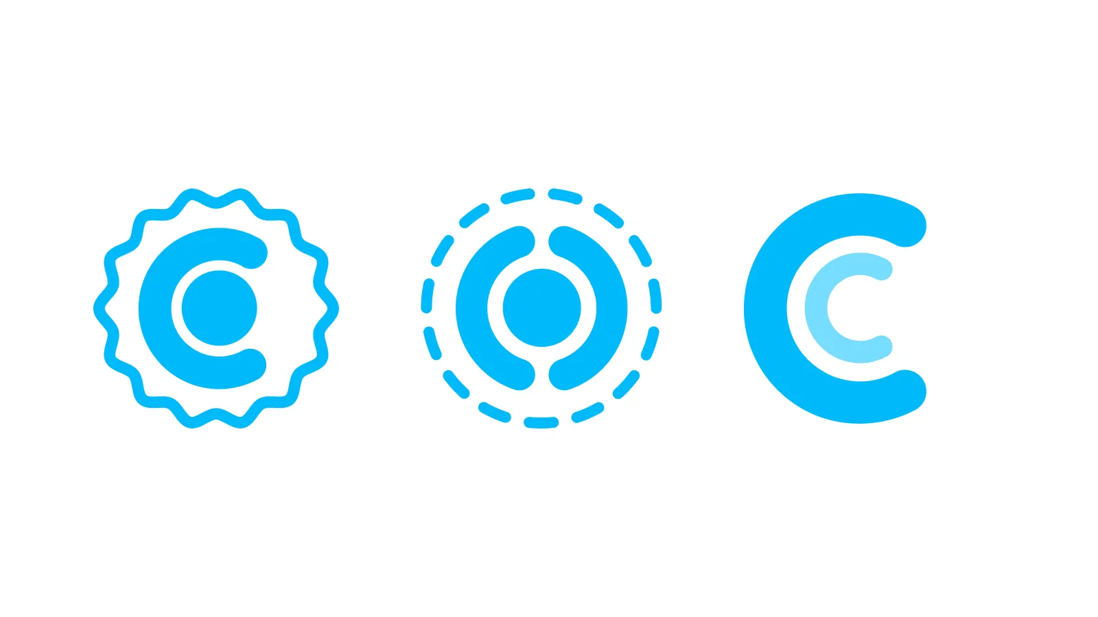
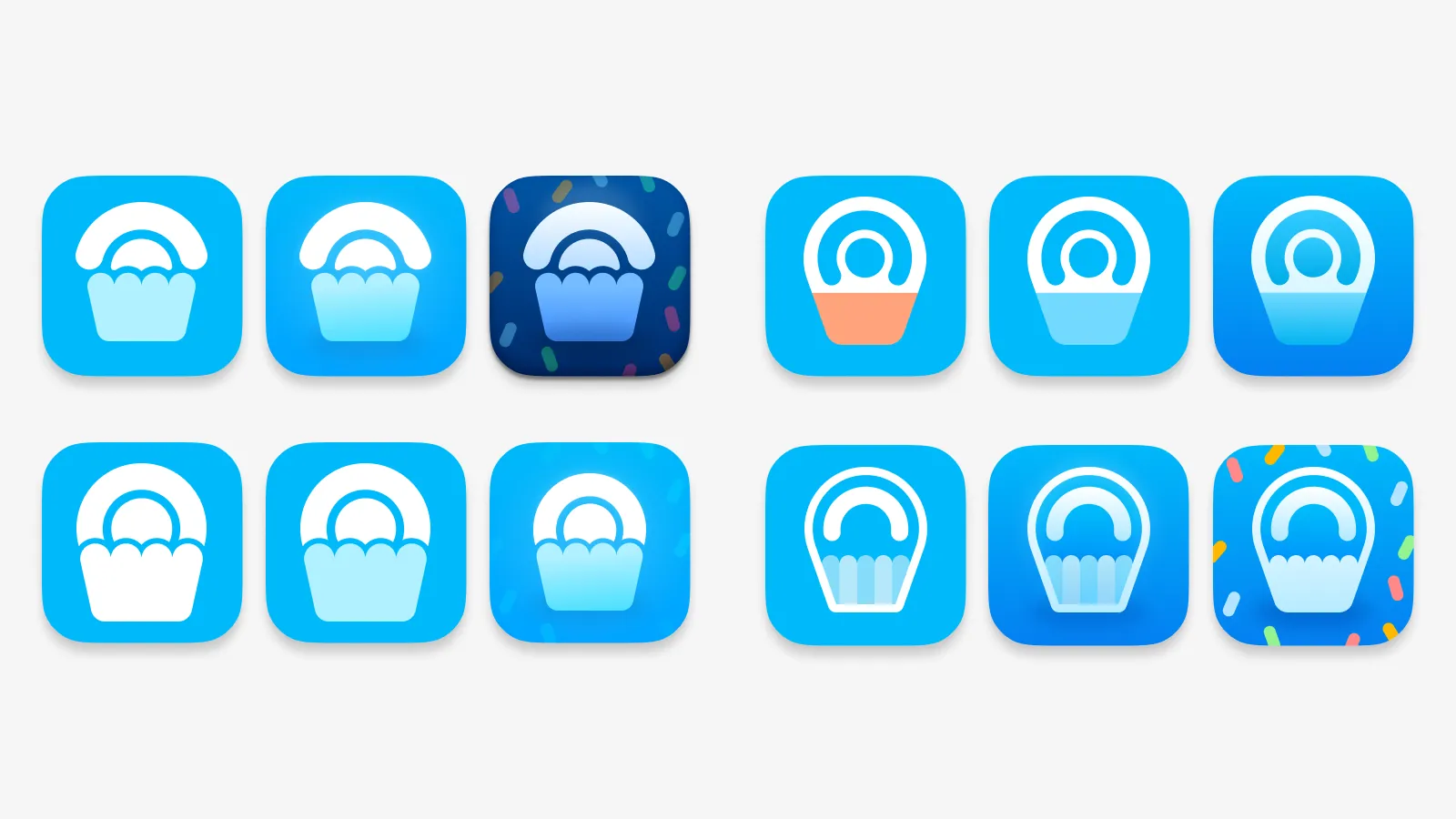
The first idea that came to mind for an air-gapped crypto wallet was surround the current Cake Wallet logo into some sort of protective field, as it visually can represent the idea behind the tech
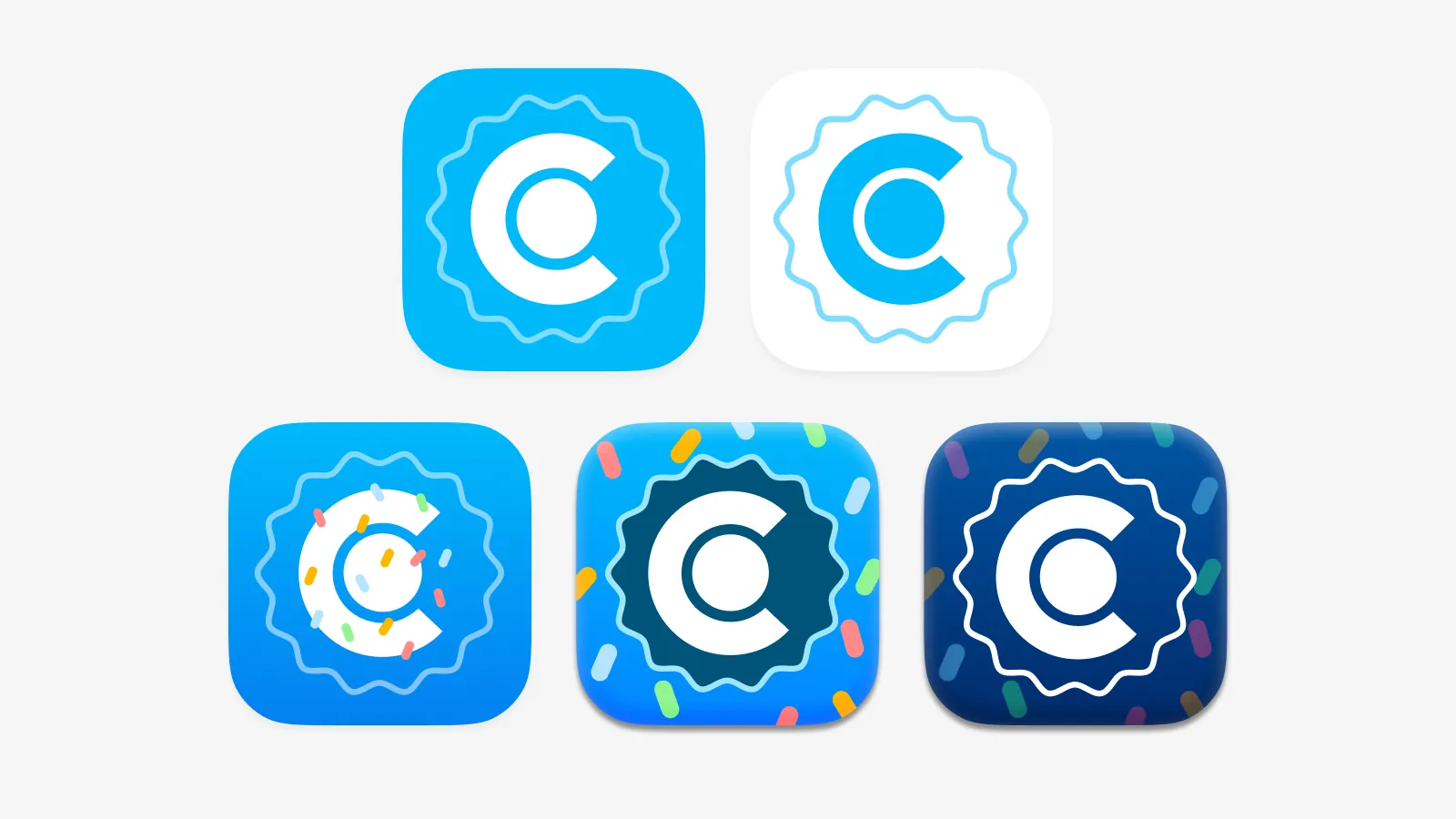
The first concept of those showed some promise, abstracting the idea of the cupcake wrapper and making it that visual element
What the folks at Cake most loved about the first concepts where the color choices and finishing, showing great interest in the idea of the sprinkles being part of the design
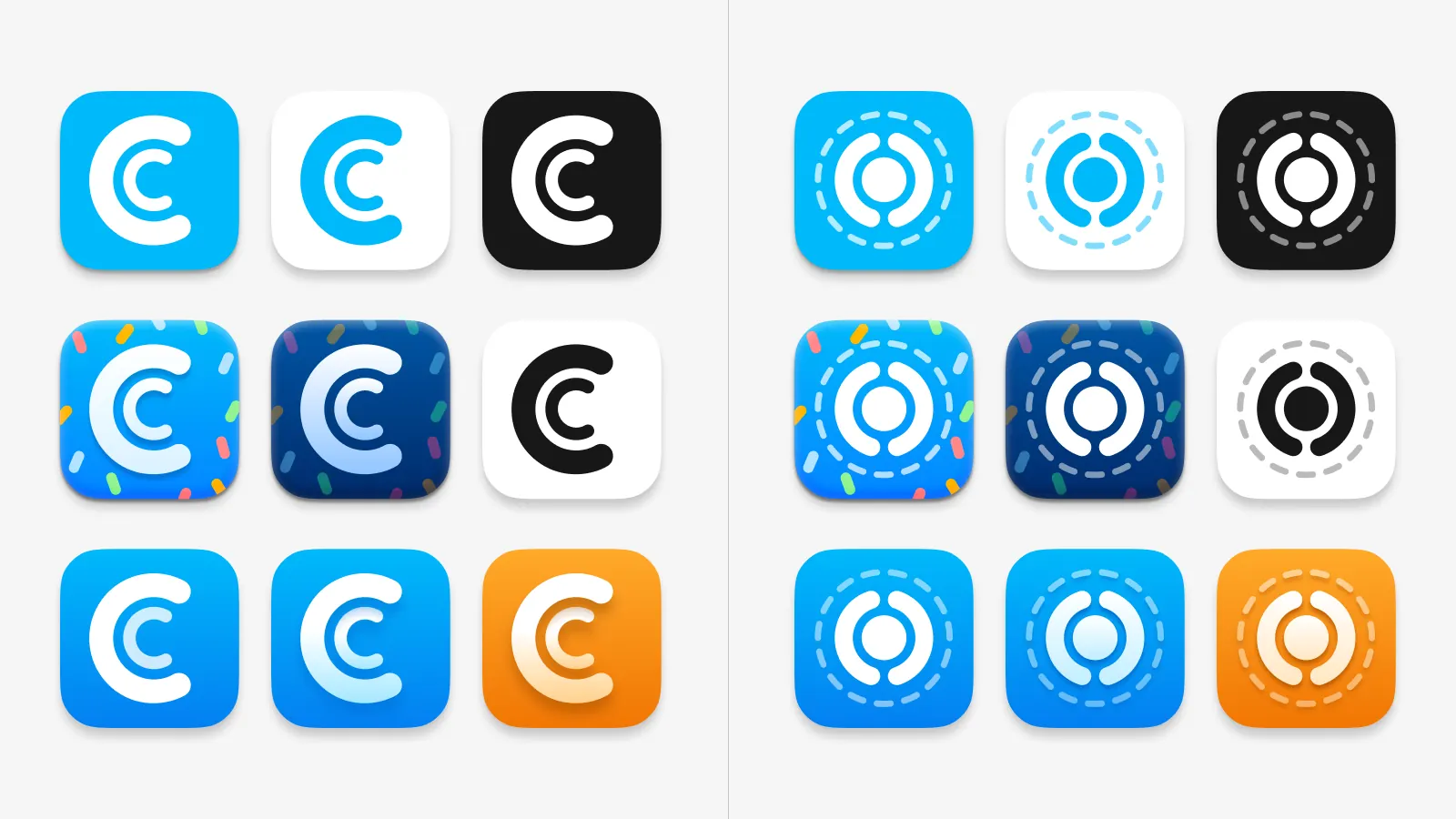
We also decided that the color scheme would be inverted from the usual white bg and blue symbol, so as to make a clearer visual distinction that it is a companion app to be used alongside Cake Wallet
I tried some others, but they ended up being too abstract to be successful. So this line of concepts needed some pause, as it was not the strongest kind of visual mark to go along with a name that evocative and strong (Cupcake)
So I tried to integrate the Cake Wallet logo (or a simpler version of) in the shape of a cupcake, in a more representational manner that I thought was truer to the name and still went along good with the existing apps
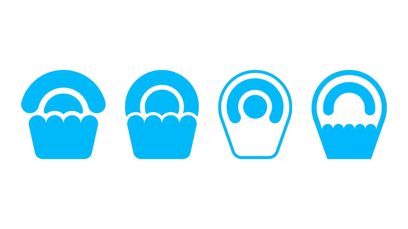
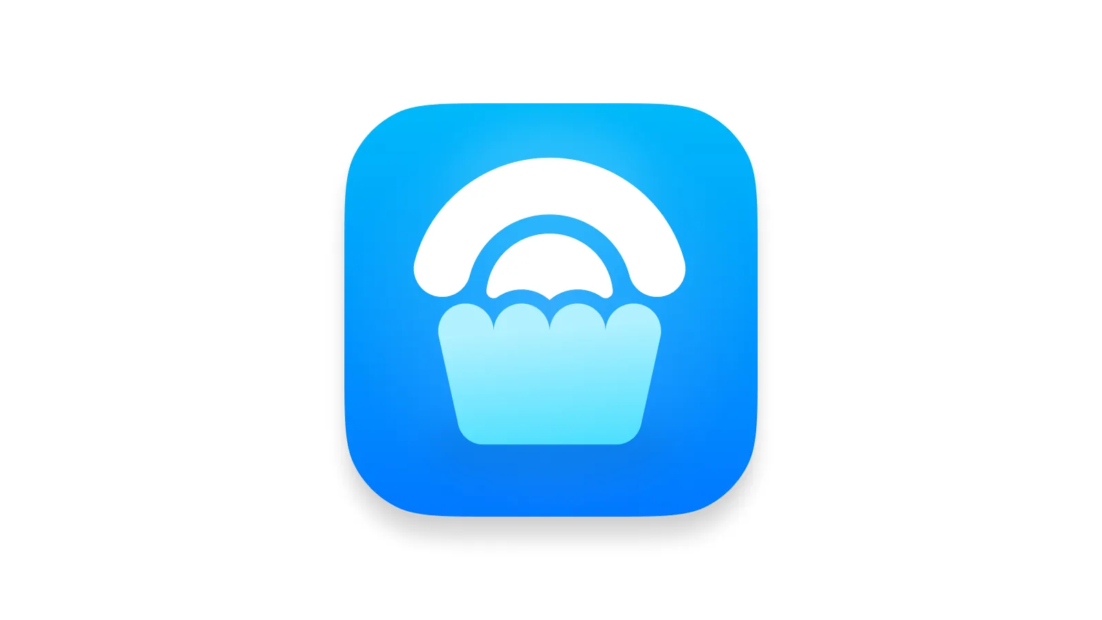
There were many attempts, but after all, one stood clearly on top (in my opinion). I was secretly desiring they chose it, and it ended up being their preferred one:
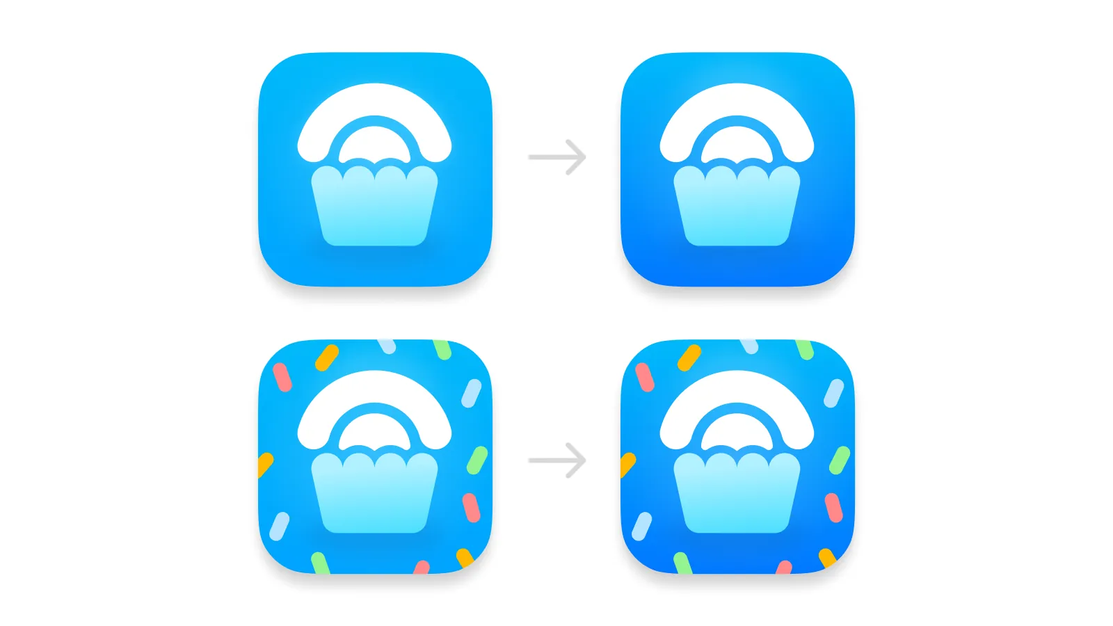
When it came to the final retouches and finishing, we opted for a more pronounced gradient with a deeper blue, that made the icon pop a little more
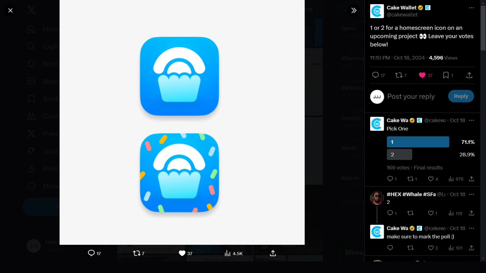
We ended up with the final two options, and Cake decided to run a poll on their users, to choose the app icon “of an upcoming project”. It was a clear 71% vote for the first option, so we had a winner
