 September, 2024
Concept
A full rebrand proposal for the whole brand architecture of Cake Labs, a company creating open source cryptocurrency wallets
Brand Architecture
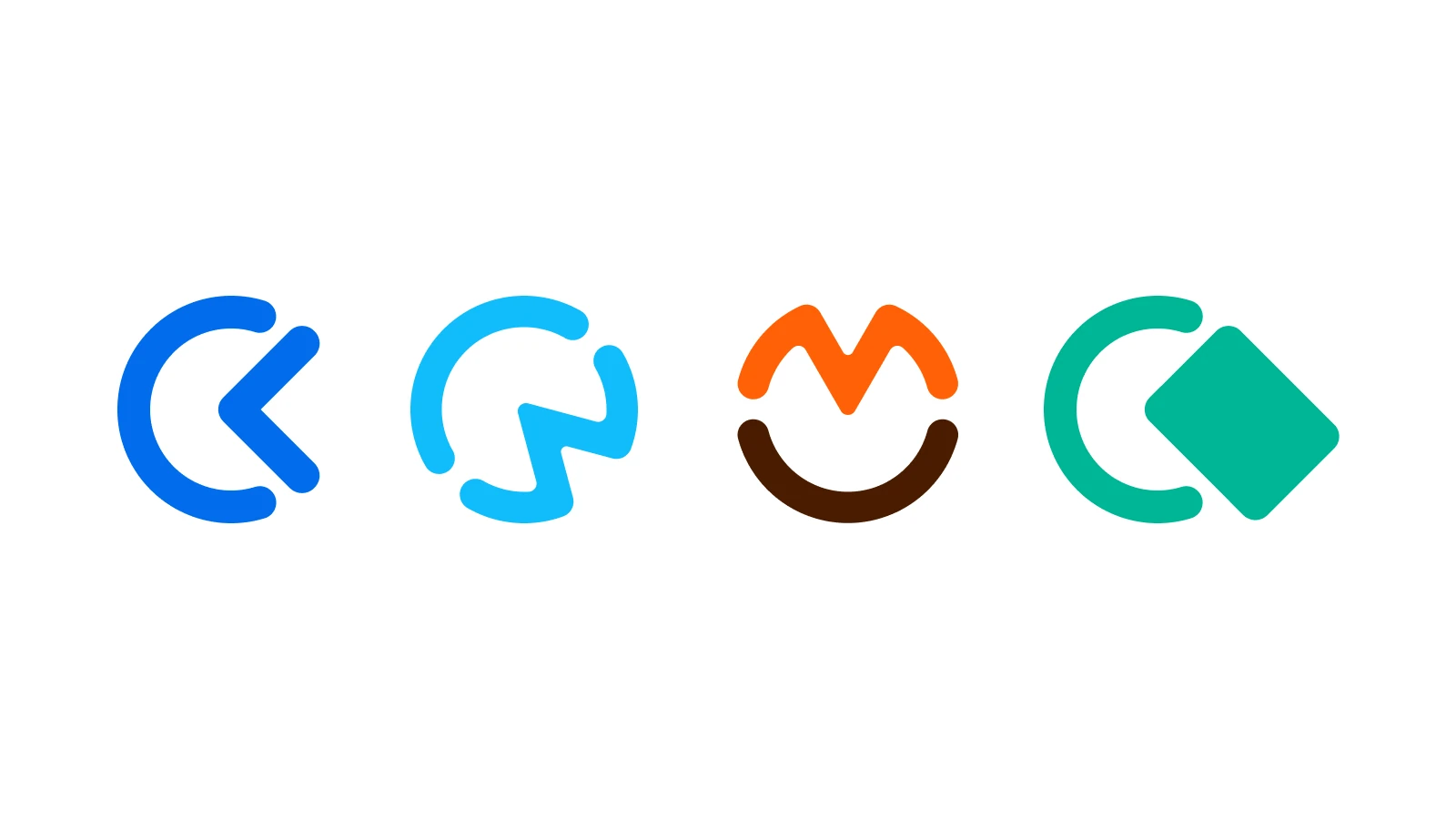
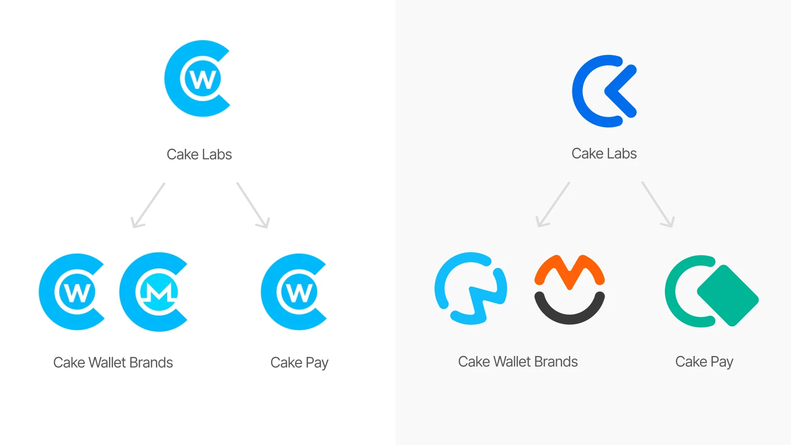
The current brand architecture is consistent but too uniform. It does benefit from the popularity of Cake Wallet (their best known product) to build a solid association, but it limits the possibility of differenciation among the products
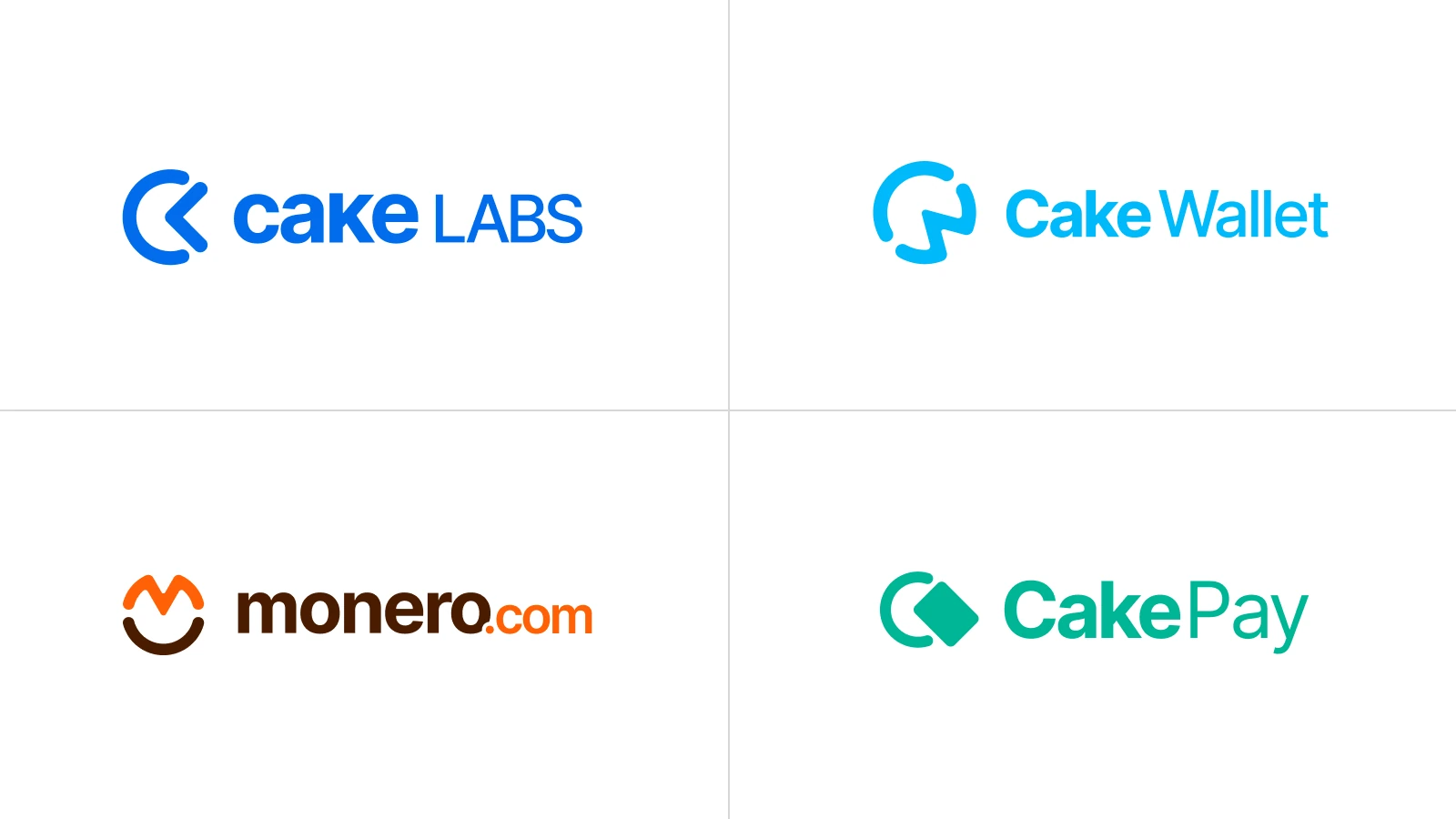
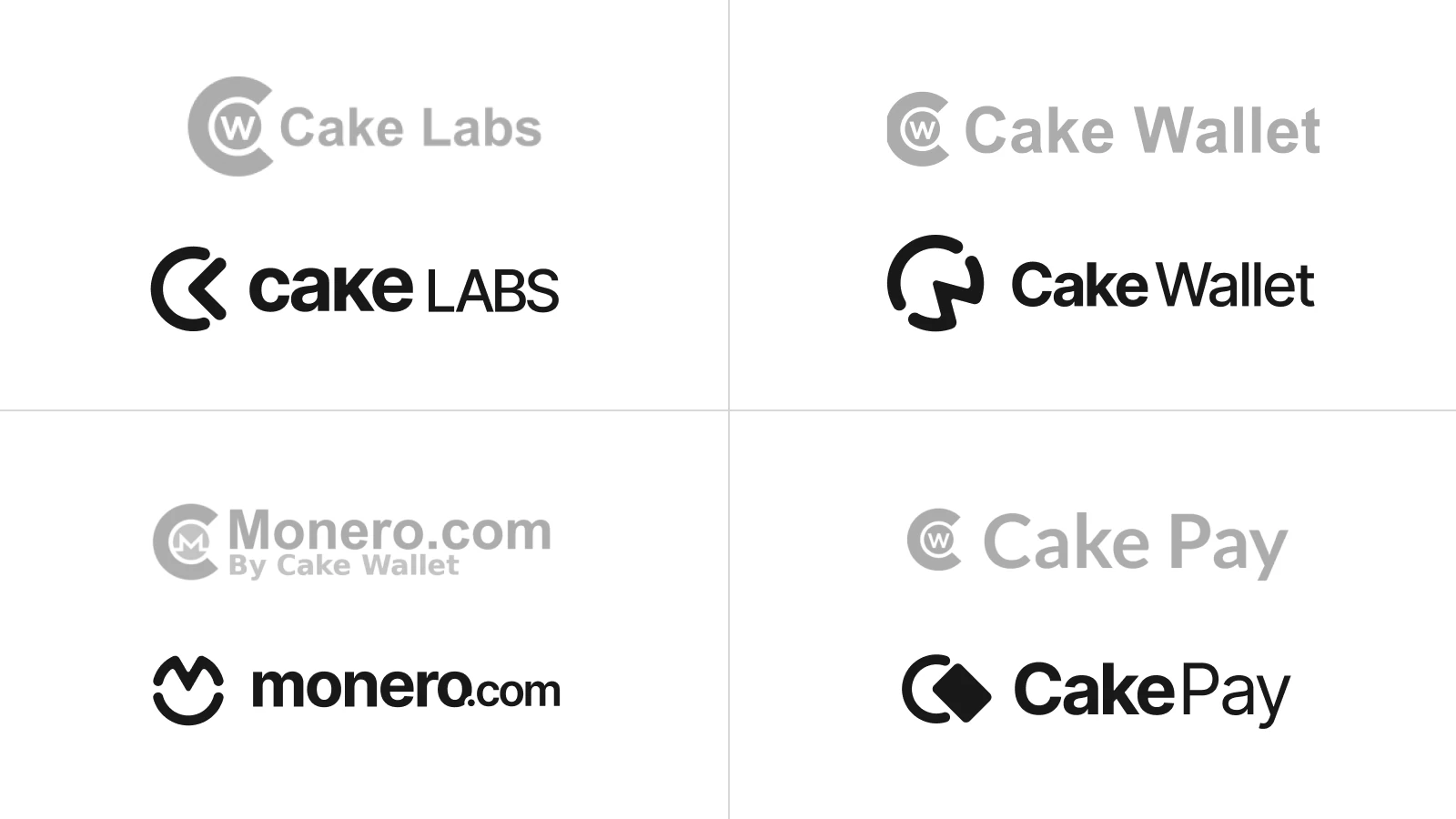
My proposal follows a common stylistic pattern and concept: the silhouette of an abstracted cake; but still differenciates both in shape and color
Cake Wallet
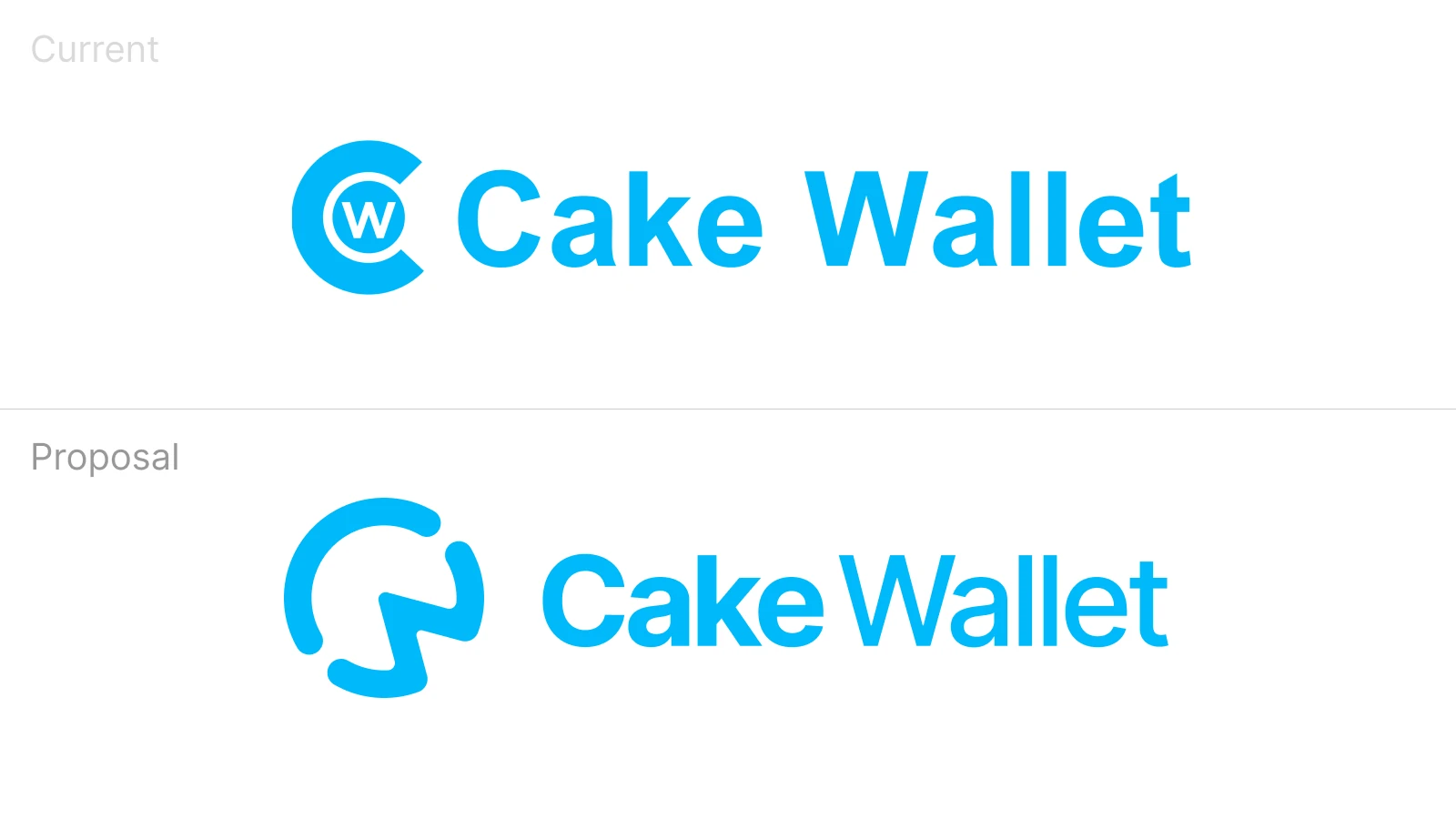
The main brand and app, with a community of tens of thousands of users. It is the current base of the whole brand architecture
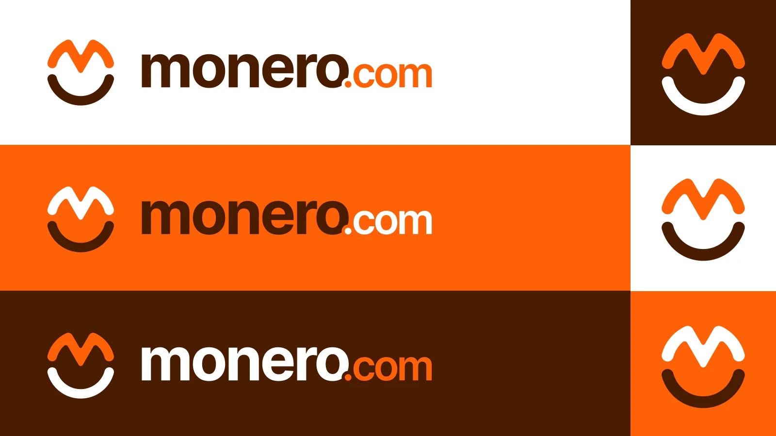
Monero.com
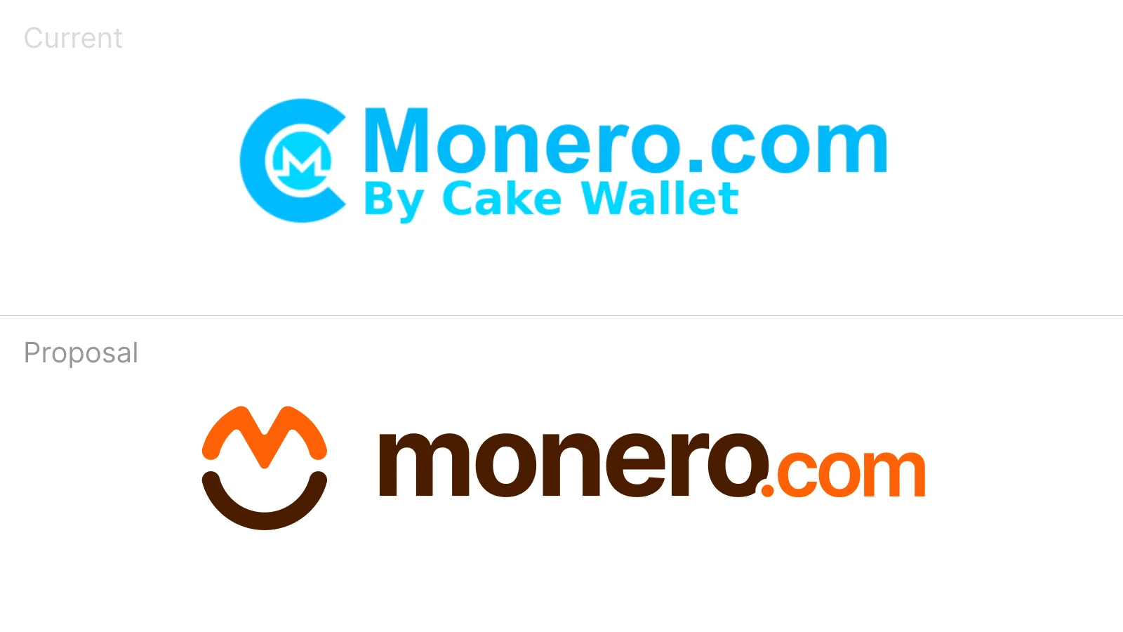
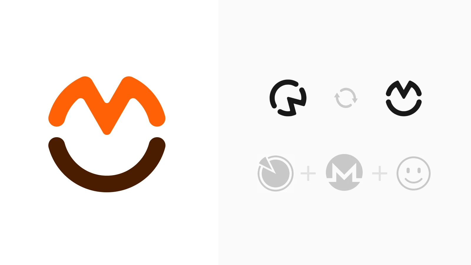
An informational website and a coin-exclusive wallet for Monero, the private cryptocurrency. In practice, it is just the same app as Cake Wallet, but only supports Monero
Because of that, the symbol used is the same as Cake Wallet, but rotated, creating an ‘M’ with what was a ‘W’

Cake Labs
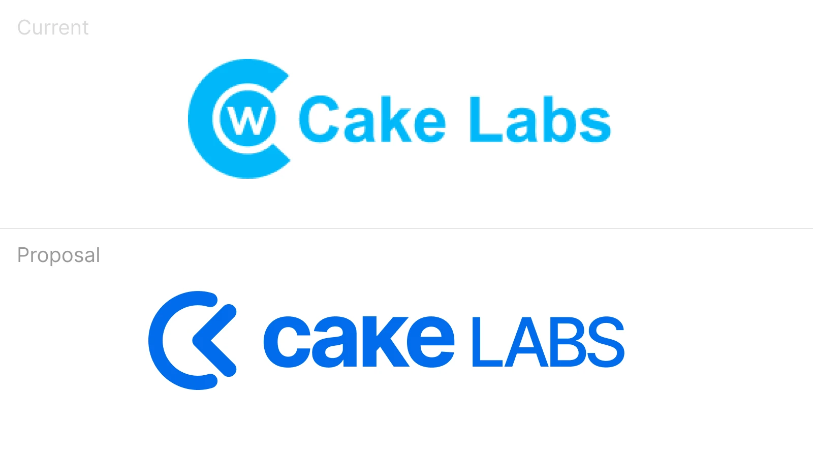
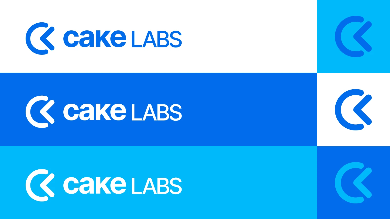
The corporate brand for Cake Labs, which is not as widely used nor as popular as the product brands (Cake Wallet and Monero.com), but should exist as its own entity as well

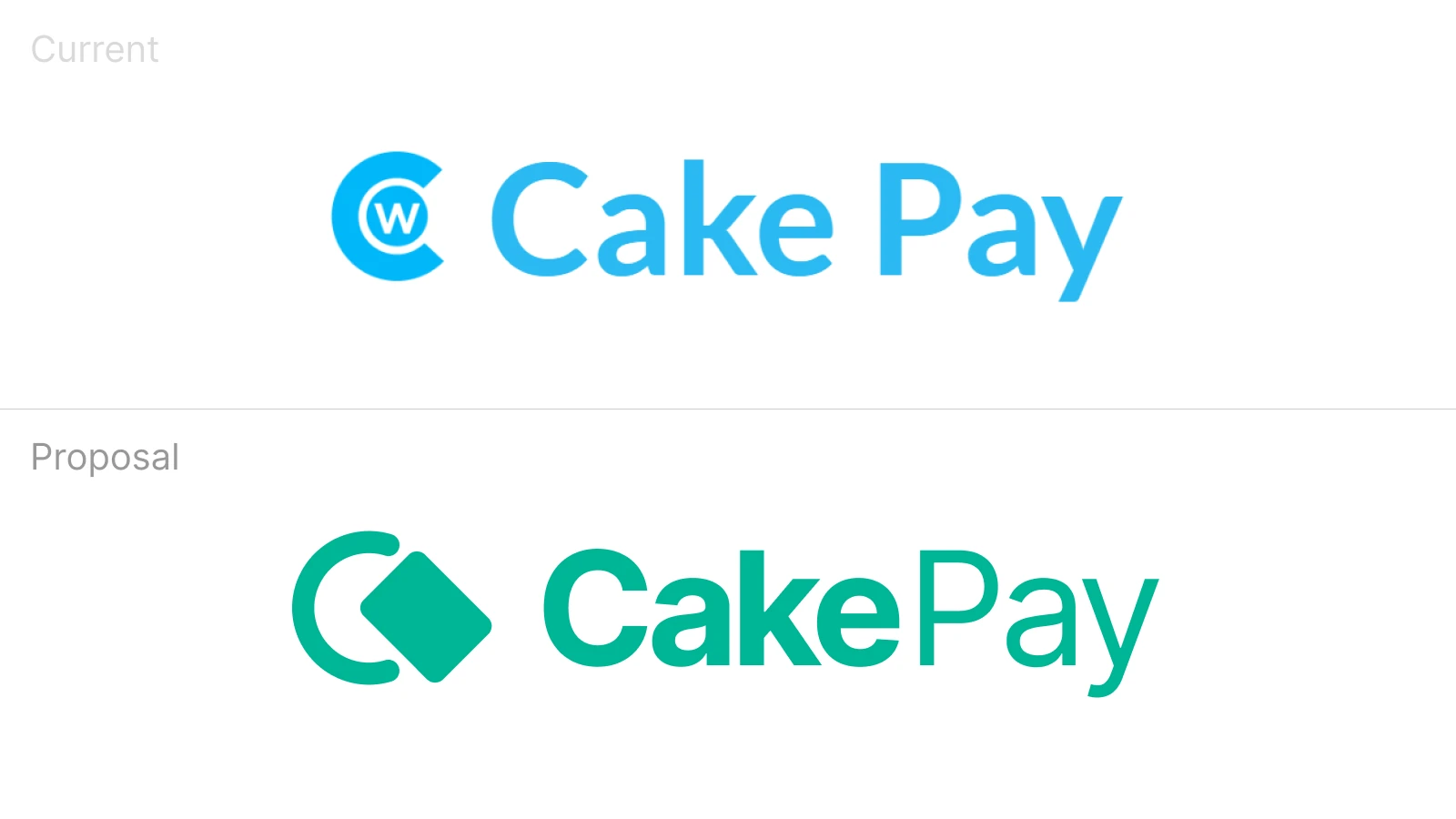
Cake Pay
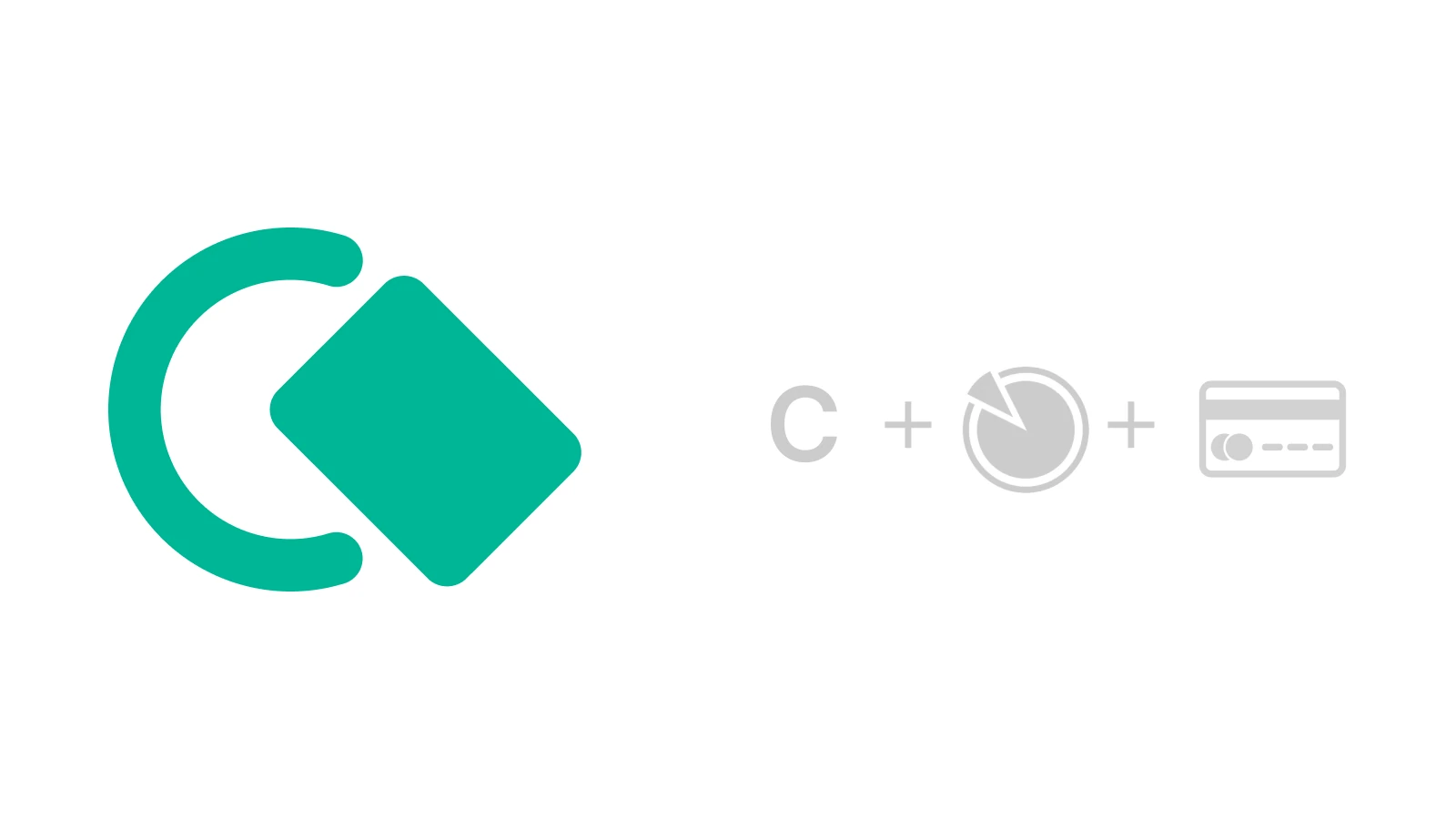
Cake Pay is a gift card service by Cake Labs, it lets users obtain a more widely accepted way to pay for popular services that would otherwise be unavailable for direct crypto payment
